iPhone & Galaxy viewport sizes,
including the height browsers actually leave you
Responsive layouts don't care about screen resolution. They care about the CSS pixel viewport — and what fits above the fold depends on a third number: the height left over after the browser's own UI. Here are all three, for every phone worth testing.
Last reviewed July 2026
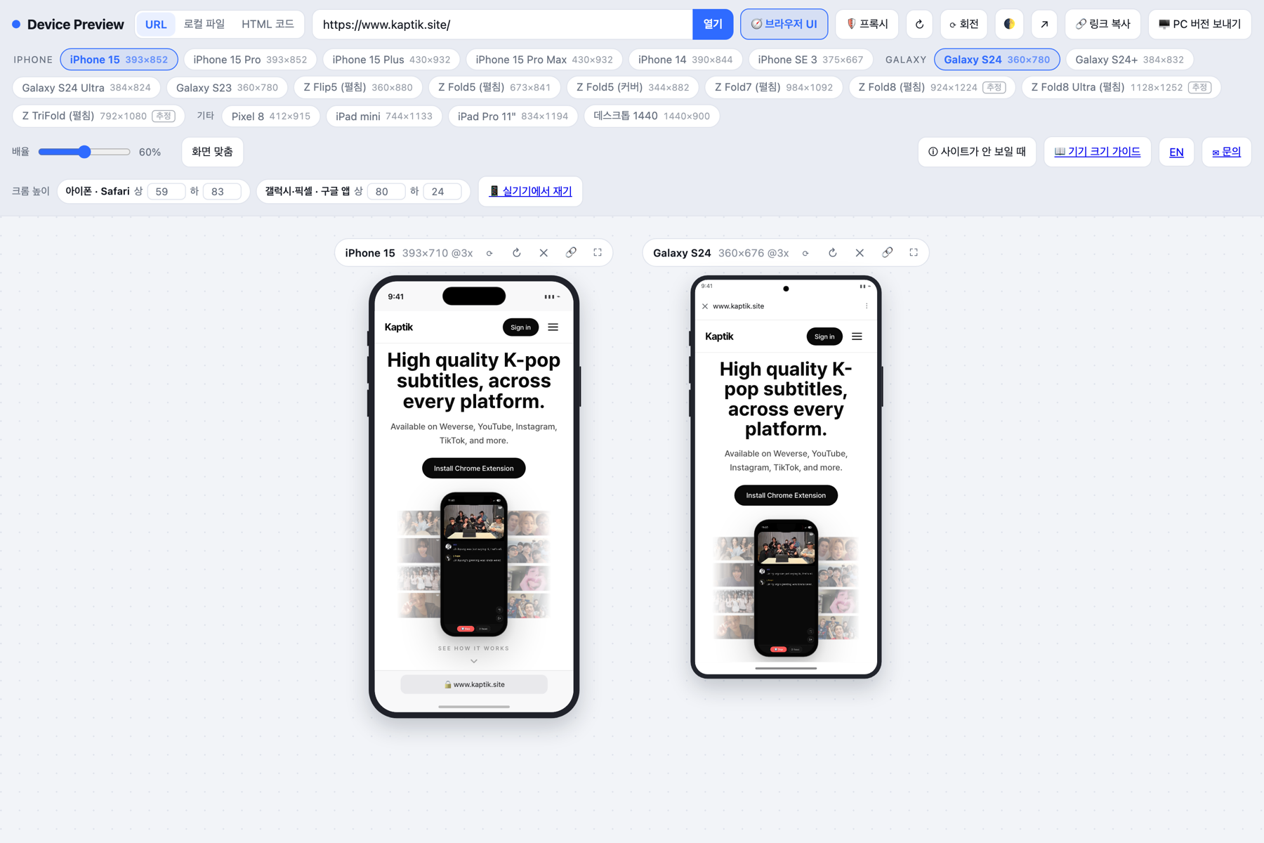
Resolution, CSS pixels, and visible height are three different numbers
The iPhone 15 has a 1179 × 2556 screen. But @media (max-width: 400px) matches at
393. The ratio between them is the device pixel ratio — 3× on this phone.
- Physical resolution — 1179 × 2556. Only matters when you export images.
- CSS pixel viewport — 393 × 852. What your media queries see.
- Visible content area — 393 × 710. What the user sees before scrolling, once Safari's chrome is subtracted.
Use the second number for breakpoints. Use the third to check whether your headline and call to action survive the fold. Most "the button was below the fold on mobile" bugs come from never looking at it.
iPhone viewport sizes (Safari)
| Device | CSS viewport | DPR | Safari content area |
|---|---|---|---|
| iPhone 15 / 15 Pro | 393 × 852 | 3x | 393 × 710 |
| iPhone 15 Plus / 15 Pro Max | 430 × 932 | 3x | 430 × 790 |
| iPhone 14 | 390 × 844 | 3x | 390 × 714 |
| iPhone SE (3rd gen) | 375 × 667 | 2x | 375 × 598 |
| iPad mini | 744 × 1133 | 2x | 744 × 1061 |
| iPad Pro 11" | 834 × 1194 | 2x | 834 × 1122 |
Portrait orientation. Since iOS 15 Safari places the address bar at the bottom of the screen.
What Safari takes from you
- Status bar — 59px on Dynamic Island phones, 47px on notched phones, 20px on Touch ID phones
- Address bar — 49px
- Home indicator — 34px (absent on Touch ID phones)
So an iPhone 15 gives you 710px, not 852. Scrolling collapses the address bar and the height grows,
which is exactly why 100vh jumps on iOS. Use 100dvh, or design against the
first-paint height.
Galaxy viewport sizes (Google app in-app browser)
On Android the answer depends on where the link was opened. A large share of search traffic never reaches the Chrome app — it opens inside the Google app's in-app browser, which adds a toolbar and leaves you less vertical room than Chrome does.
| Device | CSS viewport | DPR | Google app content area |
|---|---|---|---|
| Galaxy S24 / S23 | 360 × 780 | 3x | 360 × 676 |
| Galaxy S24+ | 384 × 832 | 3x | 384 × 728 |
| Galaxy S24 Ultra | 384 × 824 | 3.5x | 384 × 720 |
| Galaxy Z Flip5 (unfolded) | 360 × 880 | 3x | 360 × 776 |
| Galaxy Z Fold5 (unfolded) | 673 × 841 | 2.6x | 673 × 737 |
| Galaxy Z Fold5 (cover) | 344 × 882 | 2.6x | 344 × 778 |
| Pixel 8 | 412 × 915 | 2.6x | 412 × 811 |
Based on a 24px status bar, a 56px in-app browser toolbar, and a 24px gesture bar.
Turn on several devices and they line up like this. Enable browser UI to see the real above-the-fold area.
Checking your own site at these sizes
- Enter the URL you want to inspect.
- Pick several devices to line them up side by side.
- Turn on browser UI to see the real above-the-fold area instead of the full screen.
- Use the per-device fullscreen button to focus on one.
Responsive QA checklist
- No horizontal scroll at 360px — tables, code blocks and long URLs are the usual culprits.
- Headline and CTA above the fold — verify at 710px (iPhone) and 676px (Galaxy).
- Tap targets at least 44px — Apple's Human Interface Guidelines minimum.
- Body text at 16px or larger — smaller text triggers iOS auto-zoom on input focus.
- Use
100dvh—100vhbreaks when the address bar collapses. - Check foldables — 673px lands awkwardly between phone and tablet breakpoints.
Frequently asked questions
Why don't these numbers match my browser's device toolbar?
DevTools device emulation reports the CSS pixel viewport (for example 393 × 852) and does not subtract the address bar and status bar a real phone shows. That makes above-the-fold checks more optimistic than reality.
Where do the content-area figures come from?
They are derived from documented platform UI metrics, not measured on hardware: iOS uses a 59/47/20px status bar plus a 49px address bar and a 34px home indicator; Android uses a 24px status bar, a 56px in-app browser toolbar and a 24px gesture bar. Real devices can differ by a few pixels, so the tool lets you override the values with your own measurements.
Why won't some sites load in the preview?
Their servers send X-Frame-Options or a CSP frame-ancestors directive that forbids embedding. Most large services do this. Device Preview detects the block and automatically retries through a server-side proxy.
Can I test User-Agent based mobile detection?
Browsers cannot change the User-Agent inside an iframe. When the proxy is used, the server sends a device-appropriate User-Agent instead — Safari for iPhones, the Google app for Galaxy devices — so UA branching can be verified.
Why measure Galaxy against the Google app rather than Chrome?
Tapping a search result on Android often opens the Google app's own browser rather than Chrome. It adds a toolbar and leaves less vertical space, so it is the stricter and safer baseline for search traffic.